For all the progress in AI-generated text, one stubborn task has stayed painfully human: making academic figures. Flowcharts, methodology diagrams, and plots still eat up hours of a researcher’s time. A new system called PaperBanana thinks that’s about to change.
Developed by researchers from Google Cloud AI Research and Peking University, PaperBanana is designed to automatically generate publication-ready academic illustrations from plain research text. No Figma. No Illustrator. No design instincts required.
Turning Methods Text Into Finished Figures
PaperBanana isn’t just another image generator. It’s built as an agentic system—meaning multiple AI agents work together, each handling a specific role in the illustration process.
One agent retrieves visual references from existing papers. Another plans what the diagram should show. A stylist agent enforces academic design norms. A visualizer renders the image or plotting code. Finally, a critic agent reviews the result and pushes refinements back into the loop.
The goal is simple but ambitious: take raw methodology text and output figures that wouldn’t look out of place at top-tier conferences.
A Benchmark Built From Real NeurIPS Papers
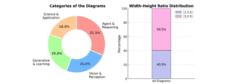
To prove this works, the team introduced a new benchmark called PaperBananaBench, built from methodology diagrams published at NeurIPS 2025. That’s notable because these figures represent some of the most polished visuals in modern AI research.
The benchmark includes 292 test cases across a wide range of domains and diagram styles, paired with reference examples. According to the authors, this setup better reflects real-world academic expectations than prior synthetic datasets.
On this benchmark, PaperBanana consistently outperformed existing baselines across four criteria: faithfulness to the source text, conciseness, readability, and visual aesthetics.

Beyond Diagrams: Plots and Polish
The system doesn’t stop at flowcharts. The researchers also tested PaperBanana on statistical plots, showing it can generate charts directly from raw data or textual descriptions.
Interestingly, the team explored two different approaches: code-based plotting versus image generation. Image models often produced more visually appealing charts—but sometimes at the cost of accuracy, introducing issues like duplicated elements or numerical inconsistencies. Code-based plots were more faithful, but less polished.
PaperBanana can also be used to upgrade human-drawn figures. By extracting design patterns from high-quality papers, it can restyle existing diagrams with cleaner layouts, better typography, and more consistent color schemes—without changing the underlying content.
Where It Still Breaks
The system isn’t flawless. The most common failures involve connection errors—extra arrows, mismatched nodes, or incorrect links between components. In some cases, even the critic agent fails to catch these mistakes.
The authors attribute this to current limitations in vision-language models, especially when reasoning over dense graphical relationships. In other words, AI still struggles with the same visual complexity that frustrates humans.
Why This Matters
As AI-generated research accelerates, visuals are becoming the next bottleneck. Papers can be drafted in hours, but figures still slow everything down—especially during revisions.
PaperBanana hints at a future where figures update automatically as methods change, and visual quality becomes standardized across labs and institutions. That could quietly reshape how research is produced, reviewed, and published.
It’s no surprise the project is already getting attention online. Tech commentator Hasan Toor described PaperBanana as eliminating one of the last “manual” steps in AI research workflows.
Conclusion
PaperBanana won’t replace human judgment anytime soon—but it could replace hours of tedious design work. If systems like this mature, the question won’t be whether AI makes research figures, but why humans ever had to do it in the first place.
